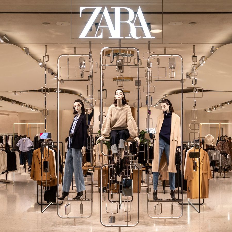
Spanish fast fashion retailer Zara unveiled an unexpected new logo last Friday designed by art director Fabien Baron, founder of Baron & Baron.

Fabien Baron is a French art director and magazine editor best known for his ad campaigns, use of typography, and work as editorial director of Andy Warhol’s Interview magazine.

The new design is a clear reflection of the work of Fabien Baron. It replaces the overly traced lettering of the previous logo with a delicate, tall serif font with ligatures and overlays to create contrast.

Many designers aren’t happy about the change because it seems the break all the rules of typography, even German typographer Erik Spiekermann tweeted “That is the worst piece of type I’ve seen in years. Was this done by one of those new robots that will replace humans?”
Although the new logo may be unconventional, we have been critical of fashion brands such as Burberry, DVF, and Balmain for their recent obsession with geometric sans serif typefaces in their newer logos over the past two years. So why get mad at something new?
The new Zara logo is disruptive in many ways, avoiding the sans serif trap to appeal to millennials and bringing something new to the fashion logo design industry by applying editorial typography to a logo.
There is also a variation of the new logo in the app store with thicker strokes and smoother ligatures between the letters.

Why there are two options is unknown, my best guess is that the main version didn’t work on a small scale. And while the ligatures in this app store logo are sleeker, its thickness makes the brand feel less dainty and luxurious.

The adjusted kerning of the new logo may seem like a mistake, but understanding Fabien Baron’s work gives you more context and makes the change easier to understand.
Plus, it is only a matter of seeing the design of the letter R of the previous logo to understand that the change has been favorable.
But well… at least that’s my F opinion

3 replies on “Zara new logo by Baron & Baron”
[…] terms of turnover for the world’s largest fast-fashion group, Inditex — the company behind Zara, Pull & Bear, Massimo Dutti, and […]
LikeLike
[…] the redesigns of its sister brands in the past couple of years, including Stradivarius in 2022 and Zara in […]
LikeLike
[…] new identity is part of Inditex’s strategy to update its brands which began with Zara in 2019 and were followed by Stradivarius and […]
LikeLike