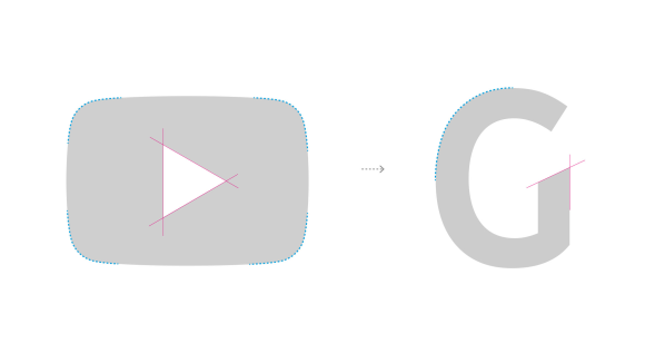
YouTube, the video-sharing platform which had a brand refresh a year ago, has joined the group of brands that had released their own-brand fonts. ‘YouTube Sans’ was launched in April of 2017 along YouTube TV and was designed by branding agency Saffron in collaboration with Letterjuice Barcelona, URW++ Hamburg, and YouTube’s UX team.


The typeface design was inspired by the curved outer edges and the triangle diagonal cuts of the red play button—the newest icon of the brand. According to Saffron, the first step was to redraw the ‘YouTube icon’ to perfect its curves and angles in order for it to function as a font glyph.
“We wanted the contrast of the roundness of the play button and the edgy triangle of the play button… This created a quite spunky combination of very memorable letters that, when we published this work, some people thought that looked sort of weird and provocative. [It is.] Otherwise it won’t stand out.”
– Gabor Schreier, chief creative officer at Saffron.


Unlike the other brands that we have seen, Coca-Cola and Airbnb, that wanted neutral typefaces, YouTube was looking for a quirky and expressive typeface that could bring brand recognition to a wide variety of digital and non-digital environments as it is the visual asset that links every touch point of YouTube TV.
I do appreciate that they designed they customized the font so it could have a recognizable design, and as much as I like that the design is based on the red button I feel that sometimes it feels forced and odd, as in the letters ‘N’ and ‘H’, nevertheless it does work in other characters such as in the ‘i’ and ‘E’.
“We wanted to create something that entered someone’s consciousness, and so bit by bit, people start to absorb this typeface and the message: ‘Ah, that’s YouTube TV talking to me!’”
– Saffron creative director, Matt Atchison


There has also been controversy around the’YouTube Sans’ type design between type designers as they mention that its design is not useful nor well thought and that it is more of a superficial branding project.
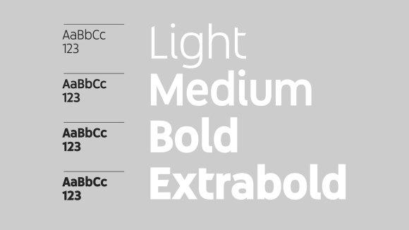
The font family includes light, medium, bold and extra bold weights to offer a broad range of uses in both product and marketing communications. For now, YouTube Sans is only used for YouTube TV titles while ‘Google Roboto’ font is used for all subheads and text.
However, Gabor Schreier, the chief creative officer at Saffron, believes YouTube Sans has the potential to beat out Roboto, which I think it would be interesting to see as it seems to me that typeface has been the designed as a display font and some of its features might not be readable on a smaller scale, as type experts have also mentioned.


Overall, I believe this is a type of design that works perfectly as a display font for titles and that will be easily recognizable in the platform and other media. However, if they want to use it instead of Roboto for subheads and text, they must review it and change some of its characteristics in order for it to be readable.
But well… at least this is my F opinion


2 replies on “YouTube Bespoke Typeface ‘YouTube Sans’”
[…] will also save the company from paying licensing fees. A step that other companies such as Airbnb, Youtube and Coca-Cola have also […]
LikeLike
[…] the other companies that we have seen on this series (Airbnb, Netflix, Youtube, Uber, and Coca-Cola), the main reason behind the decision of developing an own typeface was the […]
LikeLike