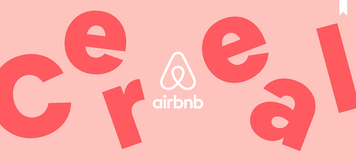
Airbnb, the pioneer of the vacation rental sharing economy, launched last May its own bespoke typeface ‘Cereal’ designed by the international independent type design studio, Dalton Maag.
Derek Chan (Creative Lead, Marketing) and Karri Saarinen (Design Lead, Design Language Systems) mentioned that the reason behind the creation of a custom-made typeface were specific business needs around brand distinction, legibility, and scalability, that no available typefaces were addressing.
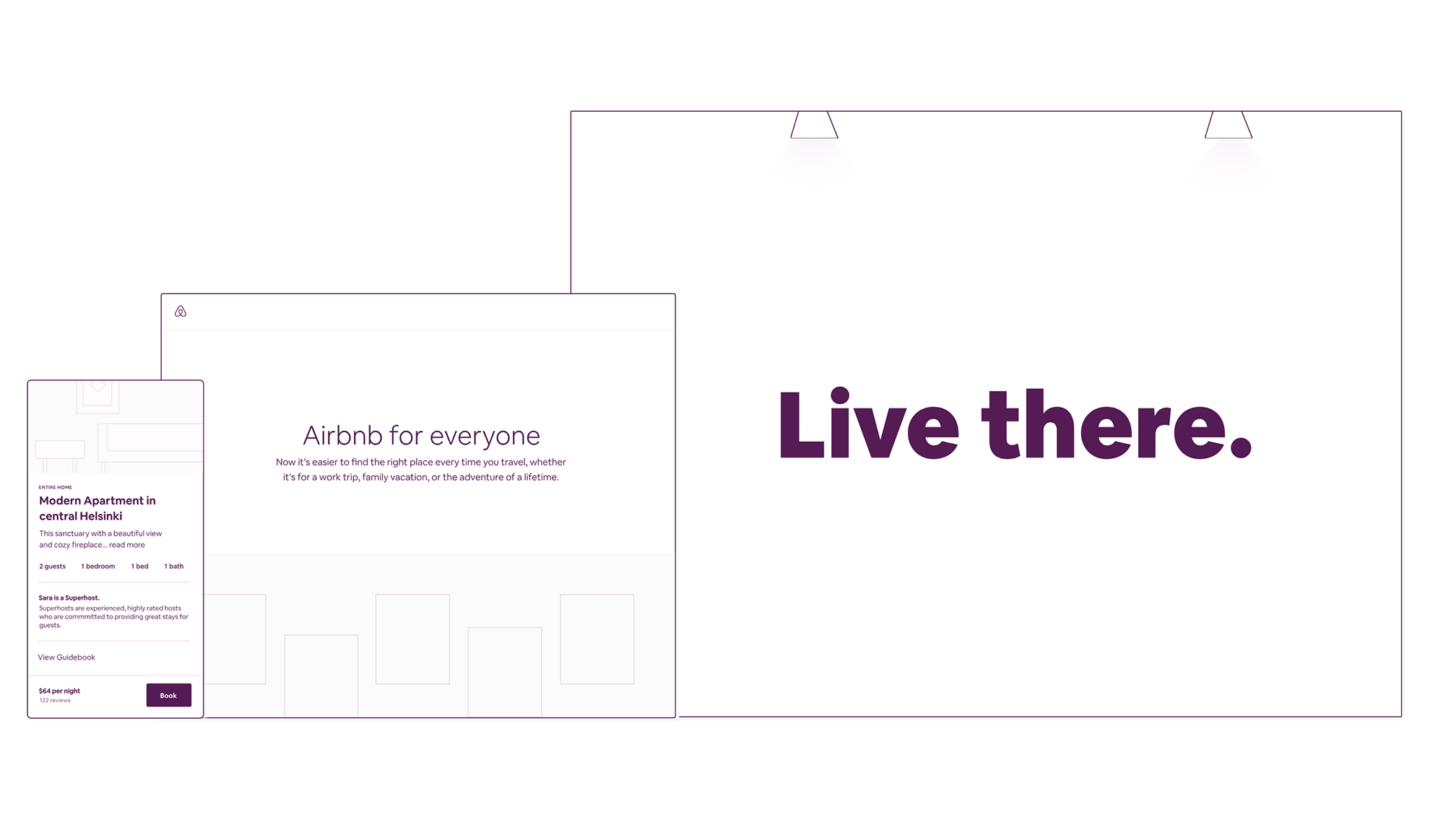
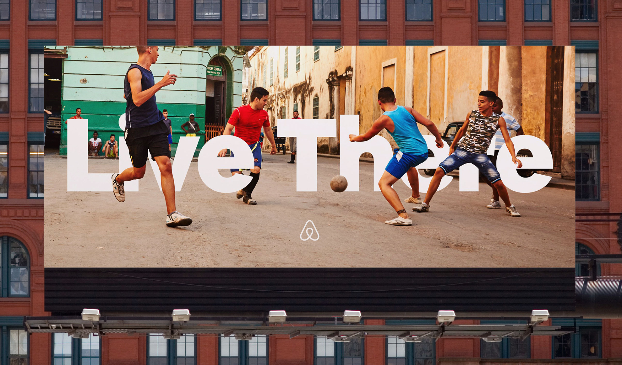
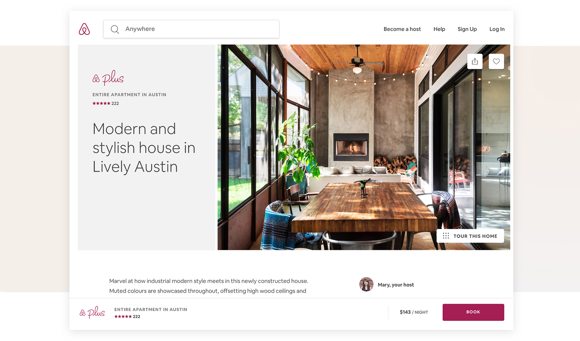
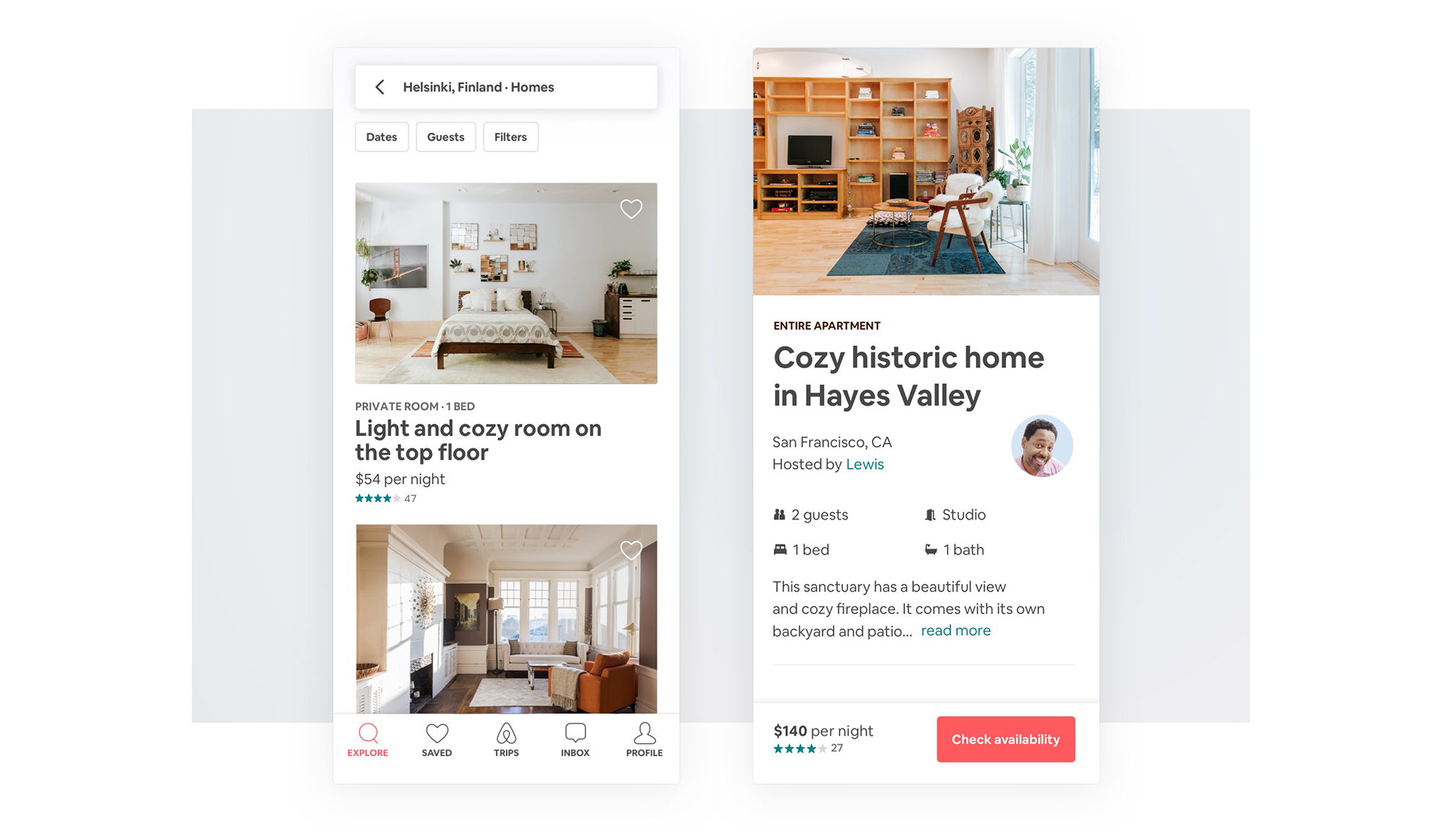
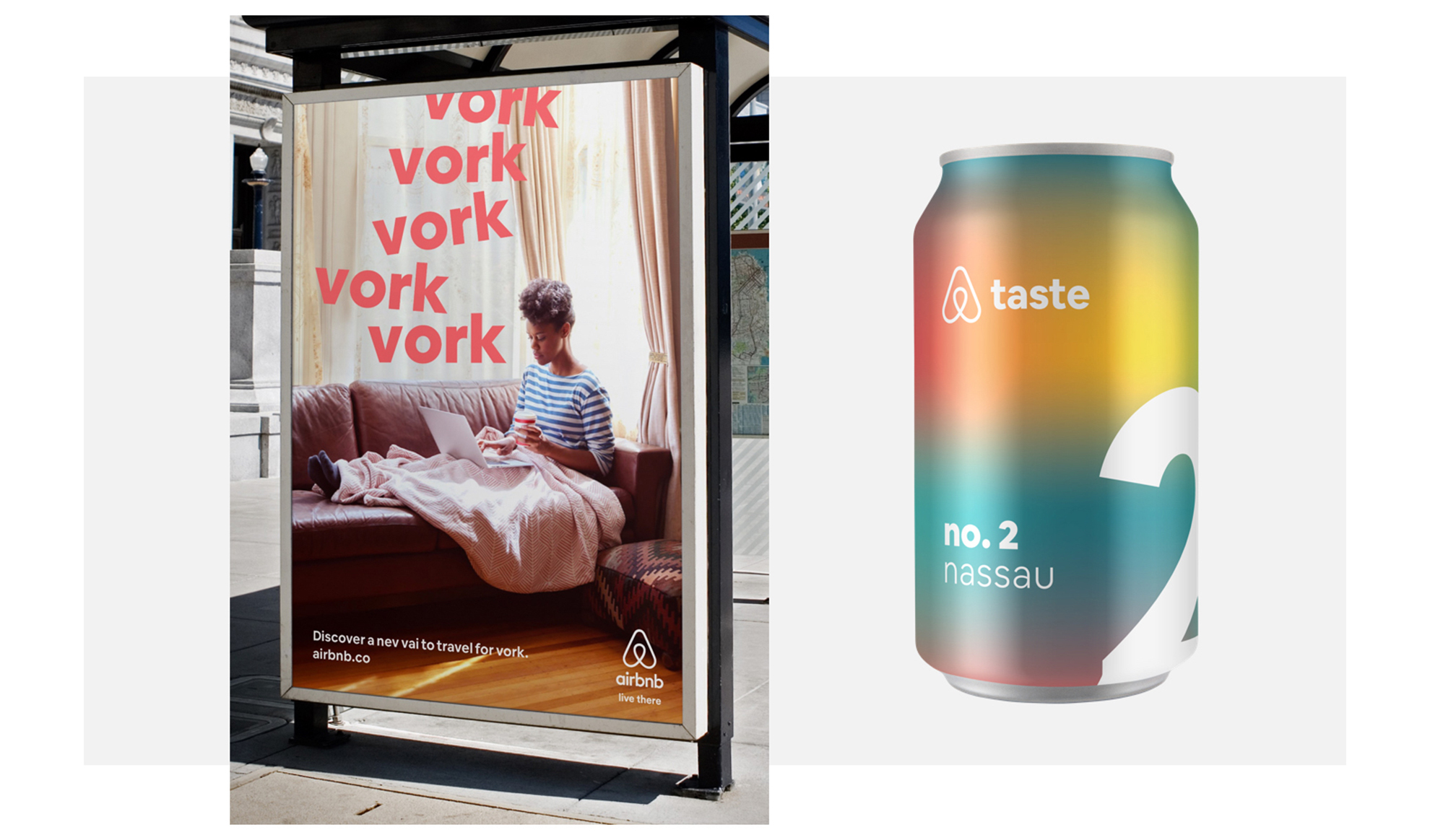
They also commented that Airbnb needed a typeface that would reflect the brand personality and function online and offline, as the brand’s work is extremely typographic and lives across multiple media including the app, Airbnbmag, billboards, web, iOS, and Android.
“As a company that’s designing online and offline experiences, we saw a clear opportunity to create a distinct typeface that can carry the weight of both—to leap off the screen to a magazine.”
Airbnb Cereal microsite
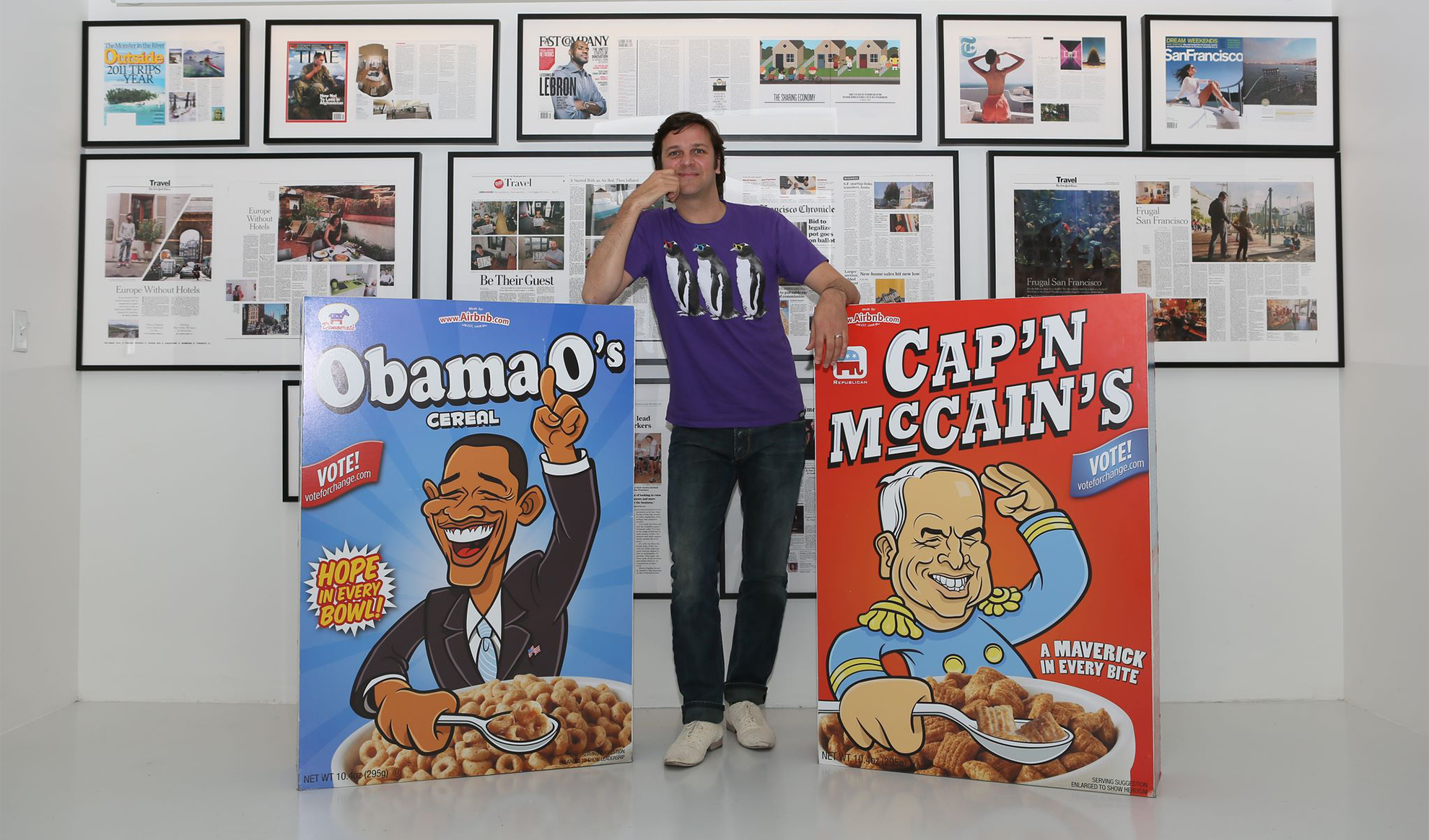
As mentioned before, the typeface is named ‘Cereal’, and even though the name might seem confusing to some people, there is a reason behind it. Derek Chan mentions that the name was chosen because it is a memory of when breakfast was a part of the company’s name and also of the time when the founders shipped Airbnb hosts free boxes of cereal—Obama O’s and Cap’n McCain’s— to save the company from a $20,000 credit card debt.
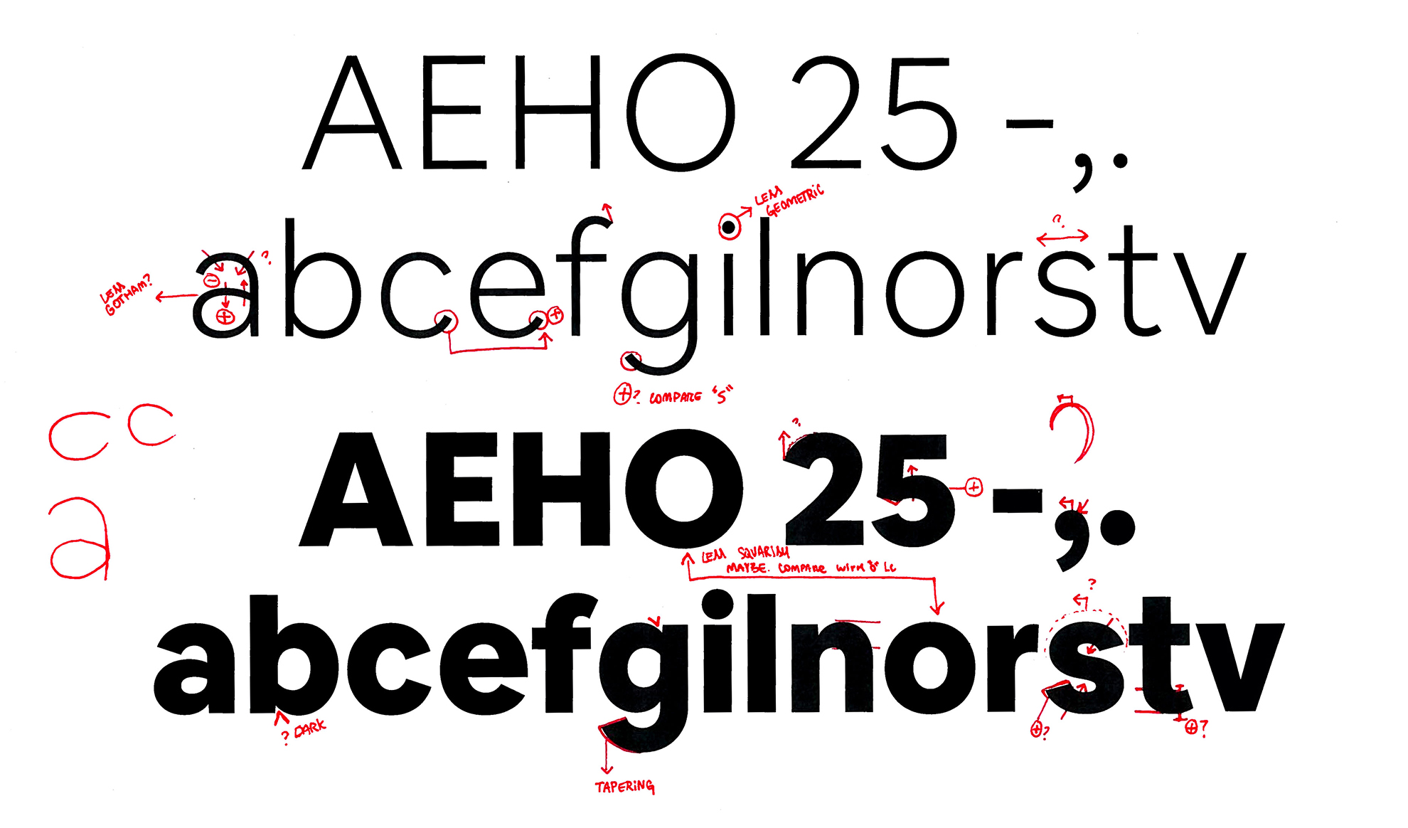
Type can get pretty small in UI design, and if the weight is too light the type can almost completely disappear. So we paid special attention to the balance of the Book weight as to not be too light or too heavy.
Karri Saarinen
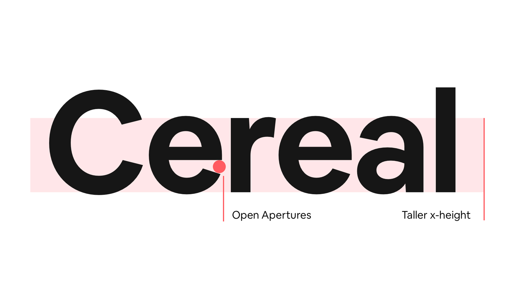
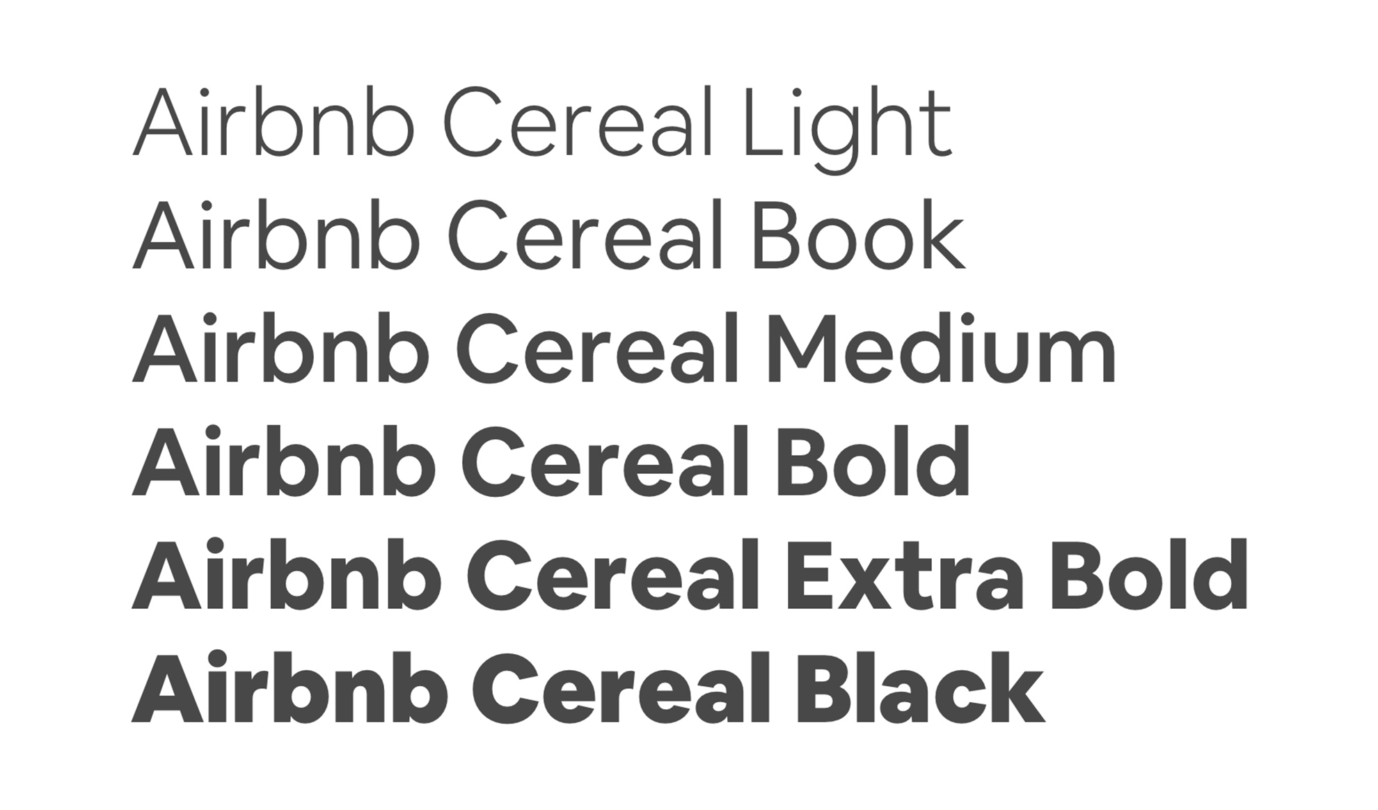
The typeface was designed for a fully functional and enjoyable reading experience in any size and media, therefore, it comes in 6 different weights, and has open apertures and an increased x-height which makes the lowercase characters easier to read.
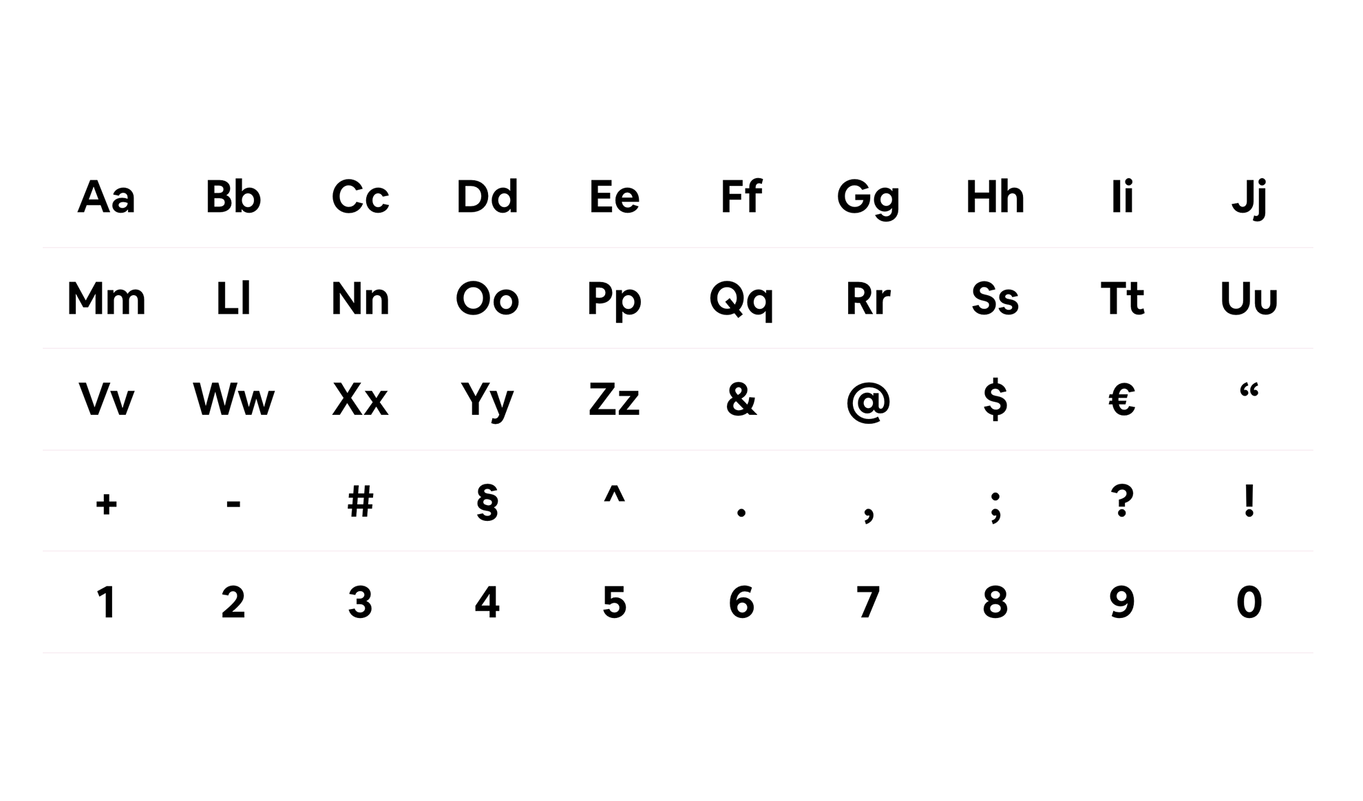
Airbnb ‘Cereal’ currently supports Latin languages and seven non-Latin based languages, however it is intended to be adapted to different script languages including Chinese, Japanese, Devanagari, Arabic, Hebrew, Cyrillic, Greek, and Thai.
Overall, the typography is very similar to ‘Circular’, which was the one they were previously using. The good thing is that even though it is really similar to ‘Circular’, Airbnb now has its own typeface that nobody else can use since it is not available for purchase or download. For me this seems like a luxury they could afford.
But well… at least this is my F opinion

9 replies on “Airbnb Bespoke Typeface ‘Cereal’”
Very similar type to Calibre!
LikeLike
Such a big fuss for a typeface? It doesn’t look original, it looks like a copy of something that already exists and makes Airbnb look immature and silly.
LikeLike
[…] the other brands that we have seen, Coca-Cola and Airbnb, that wanted neutral typefaces, YouTube was looking for a quirky and expressive typeface that […]
LikeLike
[…] asset it will also save the company from paying licensing fees. A step that other companies such as Airbnb, Youtube and Coca-Cola have also […]
LikeLike
[…] many other bespoke fonts such as “Airbnb Cereal” (designed by Dalton Maag too) and “Uber Move“, Netflix Sans is not […]
LikeLike
[…] the other companies that we have seen on this series (Airbnb, Netflix, Youtube, Uber, and Coca-Cola), the main reason behind the decision of developing an own […]
LikeLike
[…] and concisely. This is font design is more in-line with the approach that other brands like Airbnb, Uber, and Netflix, have taken when developing a bespoke typeface — a safe and simple […]
LikeLike
[…] before, most of the bespoke typefaces we have recently seen are very similar, just take a look at Airbnb Cereal and Uber Move, they are all generic sans serif […]
LikeLike
[…] seen a lot of tech brands like Airbnb, Uber, and Netflix create their own typefaces, but most of the time they’re basic geometric […]
LikeLike