![]()
Say goodbye to the pervs-smile and to the hot girls eating juicy burgers because Carl’s Jr. and Hardee’s are changing its strategy and design, and the way they did it is genius.
Carl’s Jr. and Hardee’s, the famous fast-food restaurant chains founded in 1941 and 1960 known for its big juicy burgers and hot ad girls, have decided to evolve into a new global brand with the help of 72andSunny, an agency with offices in Los Angeles, Amsterdam, and New York; and recognized by Fast Company as one of The Most Innovative Companies for two consecutive years in a row.
“They’ve never really gotten credit for their quality, and we want that message to land with consumers,”
-Jason Norcross, executive creative director, and partner at 72andSunny.
This evolution that includes a new advertising campaign, brand strategy, and a redesigned identity, aims to attract the millennial consumers, which are interested in high quality food and gender equality, by highlighting the brand’s foundation as a food-forward company that is always innovating with its high-quality products, instead of its hot and provocative ads that sexualized the female gender.
![]()
I’ve always said that Carl’s Jr. is the only brand that can make a burger sexy and that knew how to differentiate itself from the other brands with that approach, but as times change so do brands, and the way they are making this transition is amazing. The brand is not launching a new identity from anywhere and suddenly throwing away their famous TV commercials with Paris Hilton, Charlotte McKinney, and Kim Kardashian; but they are telling us a fantastic story and introducing us to a new world in its new commercial so that we can understand and be part of the change.
The short film created by 72andSunny and directed by Hungry Man’s Wayne McClammy, tells us the story of why the brand was focusing on boobs instead of food. It turns out that the company was being run by the millennial CEO Carl Hardee Jr. (played by comedian Drew Tarver-), the wild son of the founder Carl Hardee Sr. (played by Charles Esten), but it seems that his party is over because his dad is back to make Carl’s Jr. Great Again.
Isn’t it great!? If they had just done the redesign and just launched it like most of the brands, without giving explanations or involve their consumers into the process, believe me, this would have been a completely different post. This is the magic of storytelling, is selling an idea by making connections with your user, and Carl’s Jr. really understood that they moved from “sex sells” to “storytelling sells”.
“People didn’t know about it, or we told them so long ago they forgot. 72andSunny described it well when they said we have a great food story, we just need a great storyteller.”
-CKE Chief Marketing Officer Brad Haley
![]()
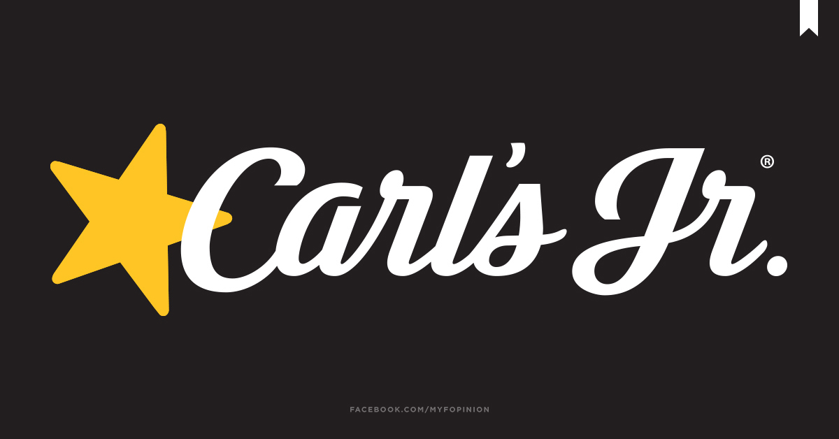
Along with this fabulous short film, the brand is launching a series of short ads, a new brand identity, and a strong tagline that positions the brand as the “Pioneers of the Great American Burger”. They have decided to leave its childish image and go for an upscale and contemporary look to convey the higher quality of their food. The new logo is a simplified version of the old one, it keeps the script typography and the famous yellow star on a black background, and gets rid of the creepy “happy” face inside the star and the chubby red outline.
![]()
This new identity comes all together in the menu design and the short ads that feature dark and bold photos of the burgers that highlight its sinful deliciousness, paired with big and bold titles using Hoefler & Co.’s Knockout and a script font with yellow accents.
![]()
Personally, I’ve never associated Carl’s Jr. with children, but with big and tasteful burgers, and I think this new strategy and design is really highlighting that feature and meets it objective of taking the brand to a higher level, maybe not as high as a gourmet restaurant, but high as in the fast-food industry; something they needed especially now that new premium burger brands, like Shake Shack and Five Guys, are turning into real competitors.
![]()
![]()
As for the packaging design, there is not much to say, it is kind of basic and looks like a prototype judging from the quality of the renders. The fries packaging for some reason looks familiar, maybe because they have been using the black and white in their past burger boxes, but the one that really looks different is the bag, even though is really simple it kind of gives me this vibe of a rockstar.
“We didn’t want to all of a sudden go from controversial, provocative brand, to the boring brand… We saw that there was an opportunity to poke fun at the past and pivot into a new story.”
– 72andSunny Executive Creative Director and Partner Jason Norcross.
In conclusion, I think that graphically it is a successful brand refresh that gives Carl’s Jr and Hardee’s the chance to stay relevant in a new era, but beyond that, the thing that deserves a standing ovation is the storytelling, there are only a few brands that spend time doing this types of strategies to introduce their redesigns, and definitely Carl’s Jr knew how to do it. And as for the sexy commercials of the past, I do think they will be part of the history of fast-food and marketing.
But well... That’s my F Opinion
UPDATE JUNE 2017
The devil is back. After the backlash of removing the smile from the star, Carl’s Jr has decided to bring it back. Too bad they couldn’t stay true to their beliefs.
![]()

5 replies on “Carl’s Jr by 72andSunny”
Hi! I just posted my opinion on the same subject! And I mention you, but I can really add it like a tag. So follow my blog and leave your comment in my post 😀
LikeLike
[…] Para ver el re-branding que mencionamos junto con su video de publicidad y su nueva identidad, te invitamos a visitar @myfopinion donde nos lo comparte junto con su opinión acerca del tema. ¡Da click aquí! Carl’s Jr by 72andSunny […]
LikeLike
They brought back the perv smile, ICYMI
LikeLike
The demon is back!
LikeLike
From a designer standpoint, it’s nice and clean. From a customer standpoint, I saw the sign today and it looks like a funeral home. Not great during this pandemic. A for effort though. ⭐🍔
LikeLike