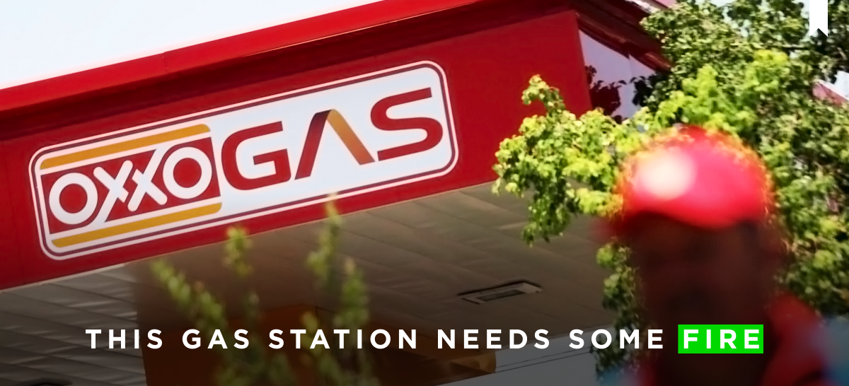
I can’t end this 2016 without talking about this, the new identity for the Mexican gas stations “Oxxo Gas”, which is part of the company Oxxo, the largest chain of convenience stores in Mexico owned by FEMSA -the largest franchise bottler of Coca-Cola products in the world by volume.
To give you a little bit of context let me tell you a story, not so long ago and almost for 80 decades the only brand of gas stations in Mexico was PEMEX (don’t ask me why), but now with the new Energy reform different brands such as Gulf and Chevron will start appearing in the country, along with new national brands including “Oxxo Gas.” That is why this moment is so important, it’s a great time for companies to hire great designers to build solid and remarkable brands that can stand out from the competition… or they can do what Oxxo Gas did…

As you can expect, there is no information about this design, you can’t find who designed it, what’s the concept behind it, nor even a sneak peek of the new materials, the only thing that you can find is that this logo is supposed to represent quality, dynamism, energy, and confidence… What?… In other words, this logo represents a lack of concept and research process.
“…the opportunity to evolve the brand, to a more modern identity that represents quality, dynamism, energy and confidence”
– Oxxo Gas
The new identity will be applied in more than 300 gas stations across 14 states of Mexico, starting in San Pedro Garza García, Nuevo Leon, Mexico, with the first renovated gas station that includes sustainable energy, electricity and water saving, and technology.


There is no reason to really go deep into this design, we all know it’s bad, the futuristic/sci-fi movie typography next to the famous “OXXO” logo and the surrounded with a box it’s just bad. I don’t understand why they decided to go with a completely different style instead of growing the OXXO identity they already have, or if they really wanted to go crazy and innovate with a “cool” design, let me tell you that this is not the way to go.
And then we have the icon, which is like a ball of fire about to explode for the excess of diesel it has. And because there is no info about what it actually is, people can start imaging whatever they want, like my mom that said that it is like a monogram from the O’s and X’s from OXXO (which is not a bad idea). I love when my mom talks about design!

But I don’t think the “logo” is the actual problem, the problem is what they think that word means. If you go to their website, Facebook, and twitter, you will notice that they are only saying “Our new logo!” “Our new image!”, they are focusing in a logo that is horrible and as I always say: it is not everything. They need to think outside that word and start thinking about a complete identity, a brand personality, how the brand communicates, how is it going to be translated into different materials… etc. It is not just “designing a logo” and pasting it everywhere and replacing the old one with the new one, and that’s what they did.


For me, they lost a great opportunity to create a brand new identity that would have helped them to stand out from the competitors and to have a clearer idea of how to expand the brand not only in the graphics, but in advertising and architecture (which is not bad, but it’s not related to the brand). And even more, if they are planning to expand the brand into propane gas, natural gas, and electricity for cars as they mentioned.
But well… That’s my F Opinion
As I mention at the beginning, next year Mexico will be full of new brands of gas stations; here are some of the new images you will see in the streets, including the best one so far: “Petro 7” designed by Brandicts in collaboration with Re-Set and Romana. This is a great example of how this new gas stations can take advantage of the opportunity they are having to grow.
Petro 7


Hidrosina: CDMX


La Gas: Campeche and Mérida


ECO: Baja California Norte, Baja California Sur and Sonora


