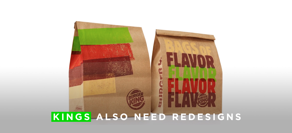
First it was McDonalds and now Burger King. Apparently the king’s burger chain didn’t want to be left behind and decided to redesign its packaging with the help of “Turner Duckworth Design”, international agency dedicated to design iconic visual identities and packaging for consumer brands as Levi’s and Coca Cola.
Burger King will launch this redesign in more than 100 countries, that is why they wanted a global image that besides being visually appealing, was functional and allowed the BK’s staff to serve faster.
The concept of this redesign is “Be your way”, which had already been used before to promote that all their burgers could be customized, but now BK have added another meaning to this concept: to encourage customers to be themselves, just like their burgers that are all different and individual because they are all flame grilled.


The identity is based on the green, red, yellow and brown colors (lettuce, tomato, cheese, and beef patty) and has an effect of hand printing, which refers to the process of making a grilled burger. For me the effect of hand printing works when the colors overlap each other, as in drive through sign, but when it is only used as a stamp it makes it look old and even sometimes unnecessary like in the fries’ packaging, where it is only decoration.
Let’s talk about the icons. First, the ones with the slogans: the negative effect they used is cool and clever, but they are very different from each other, they have different thicknesses, different weights, some have more details… they look like distant cousins that only share the last name. And know the patty icons: I like their simplicity, but they don’t go with the identity, they seem to be made with watercolors instead of with the hand printed effect.


Burger King has never been the brand of funny and happy burgers, I think that’s more McDonald’s, but it seems that the king got bored and wants to approach to his customers with a smile, such as the one in the fries packaging that shows a smile made of a chip and a drop of ketchup.
Following the concept of “being yourself”, each package is different from each other; the carry on bags have different phrases in the back, the wrapping paper can say burger or hamburger depending on how it is wrapped, and the coffee cups have different illustrations depending on their size, showing how much energy each cup of coffee can give you.
As I mentioned before this new packaging is now more practical, the burger flipper on the wrapping paper indicates where to put the hamburger so it can be perfectly packaged. I loved it, i mean.. im fascinating with it, it’s practical and creative.


In conclusion, I think they wanted to show a more “crafty” look to recover a bit of the essence of homemade, and even though the printing effect didn’t convince me, I like how they played with the illustrations and the color overlapping, but sorry, I still prefer the illustration of the previous bag, the floating elements are super cool (the other ones are ew).
But well.. at least this is my f opinion.


3 replies on “Burger King Redesign by Turner Duckworth Design”
[…] new packaging is also more colorful in comparison with its previous version designed in 2015. The new wrapping paper includes illustrations of the ingredients and adjectives such as […]
LikeLike
[…] new packaging is also more colorful in comparison with its previous version designed in 2015. The new wrapping paper includes illustrations of the ingredients and adjectives such as […]
LikeLike
[…] new packaging is also more colorful in comparison with its previous version designed in 2015. The new wrapping paper includes illustrations of the ingredients and adjectives such as […]
LikeLike